As mentioned in my previous blog (though I should really have made this one first...), here I'm going to gather the research I found on my previous topic before I changed it, juuuust in case it comes in handy at some point in the future.
After talking to Josh about my idea and getting some inspiration, I looked at various games which use lighting and silhouettes in a 3D scene to make them appear 2D. That's a bit of a mouthful, so let me explain...

The two screenshots above (from top to bottom) are from the games 'Ori and the Blind Forest' and 'Limbo'. Both are games which appear to be 2D, though use a 3D enviroment and lighting to give different effects.
You'll notice that while Ori has some colour to it, Limbo does not. What I wanted to explore was whether or not these games would have the same impact on a player if their colour schemes were different. Say for example Limbo - would it be as creepy if the game was made up of bright colours without the black silhouettes? Or would Ori feel as magical if it had the colour scheme that Limbo uses?
Here are some more games which use the 3D -> 2D effect:
- Rayman Origins
- Contrejour
- Paper Moon
- Twelve
- Badland
- Sword & Sworcery
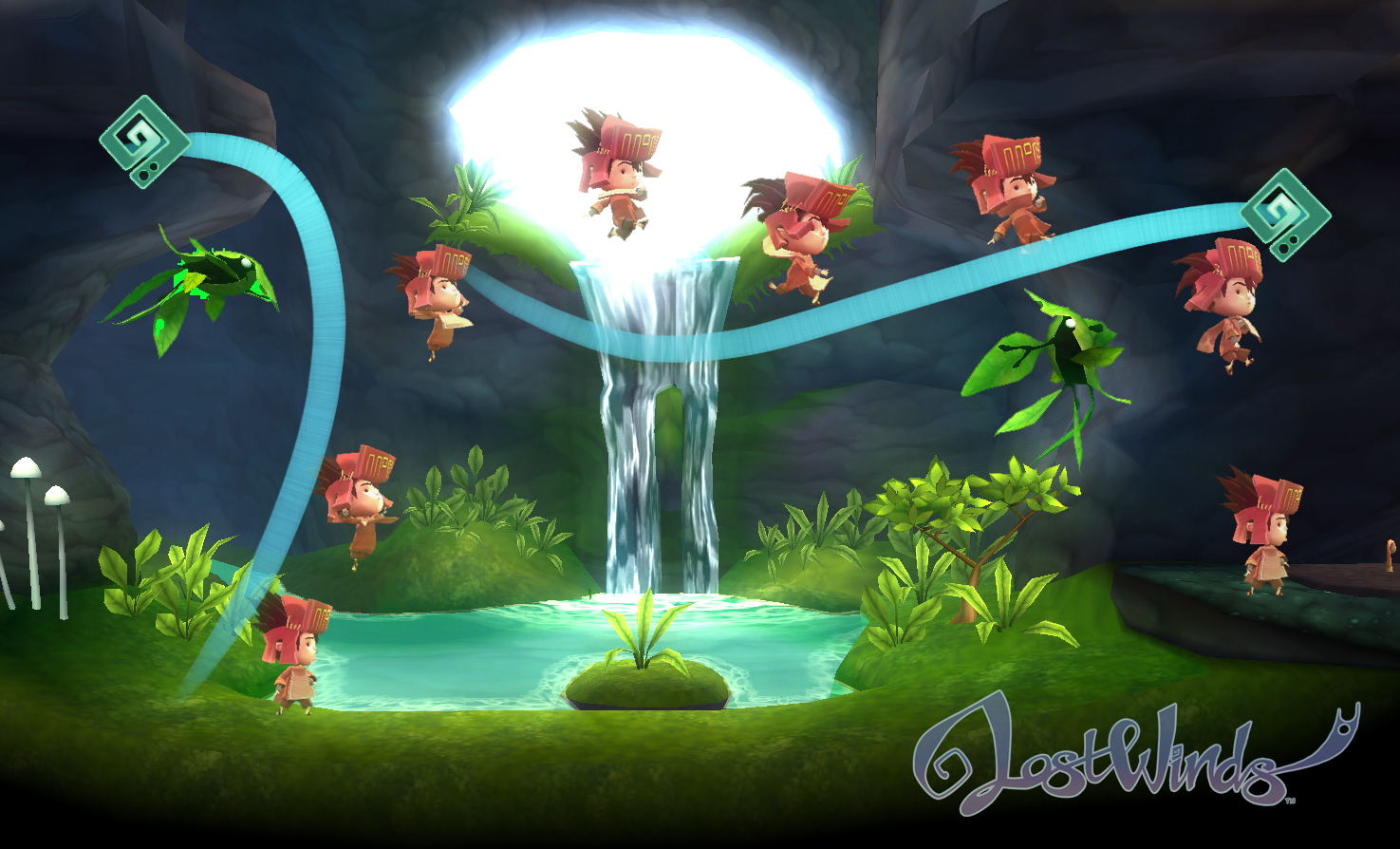
- Lost Winds
Character Design
Character design is another thing that I wanted to apply this theory to. If a player was faced with an NPC running towards them, would they react the same way to a NPC with warm and welcoming colours as they would one with dark and gloomy colours, despite the NPC acting exactly the same way both times?
Lighting
Something that would play a big part in both of these instances is lighting. Josh suggested something really cool - making real time lighting in Unity to see how the change in lighting effects the mood of a scene. Had I continued with my original project idea I would definitely have done this as I think it would be great to see how a sudden change in lighting could affect the way a person plays - would they play more cautiously if their surroundings got darker and less colourful? Or would they take more risks? Maybe they would play exactly the same way, who knows.
Colour similarities:
While looking at these games with Josh we noticed that a lot of them have something in common - the use of the same shade of blue to guide players in some way. Here are some screenshots:


If I were to pursue this idea further it would have been interesting to look into why exactly this colour is such a popular choice and used so often.
Presentation:
Along with this blog, the other thing we were given the task of doing for this week was to create a presentation to introduce ourselves and any ideas we have to the course. Here are the slides for mine:
I'm sorry that they're all under each other, I can't get blogger to let me put them next to each other neatly so this will have to do until I figure it out. ;-;
Everyone else's presentations were great and I felt more inspired listening to them than I did thinking about my own idea, so I took that as a sign that something needed to change. I'd like to thank my coursemates for that - you guys helped me a tonne without even realising it so thanks!
With this out of the way and a new found idea and inspiration in the works, I'm looking forward to getting stuck into research and creating. I'll be updating this blog more as I go along of course, so feel free to come back and have a look sometime. :)
Take care and have a nice day!


No comments:
Post a Comment